
I had completed a lot of research into album covers and came up with a lot of creative concepts during our production meetings and so I was able to play a decisive role to the production of our digipak. Because of this, the group put me forward to take the lead in constructing the panels for the album cover.
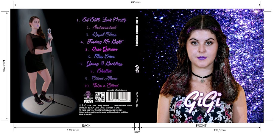
Below are the flat plans that I created for our digipak panels. Although we made a few changes during the construction process, most of the fundamental ideas were maintained.
Software
 We used Photoshop CS 5.15 to edit our digipak panels. I have used Photoshop before but I did not feel confident in my abilities going into this project. Taking the lead in producing the digipak was unnerving because it was an overwhelming task to complete and I constantly had to change the concepts in response to target audience feedback.
By the end of the the project, I feel that my Photoshop aptitude has improved a lot. By teaching Georgina, who had never used Photoshop before, I was able to reinforce my own knowledge of the basic tools as well as the more intricate tools such as magnetic lasso. I feel like being out of my comfort zone allowed me to experiment more with the activity and I received a lot of response from the target audience, allowing me to improve the product.
Below are the flat plans that I created for our digipak panels. Although we made a few changes during the construction process, most of the fundamental ideas were maintained.
 |
| Digipak - outside panels flat plan |
 |
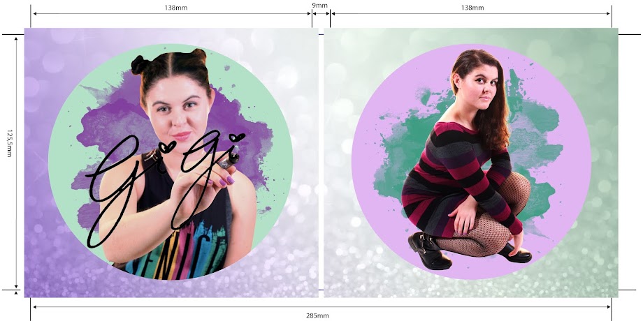
| Digipak - inside panels flat plan |
Software
 We used Photoshop CS 5.15 to edit our digipak panels. I have used Photoshop before but I did not feel confident in my abilities going into this project. Taking the lead in producing the digipak was unnerving because it was an overwhelming task to complete and I constantly had to change the concepts in response to target audience feedback.
By the end of the the project, I feel that my Photoshop aptitude has improved a lot. By teaching Georgina, who had never used Photoshop before, I was able to reinforce my own knowledge of the basic tools as well as the more intricate tools such as magnetic lasso. I feel like being out of my comfort zone allowed me to experiment more with the activity and I received a lot of response from the target audience, allowing me to improve the product.
 |
| Editing the digipak inside panels |
Process
We produced our digipak panels using the digipak template on Photoshop.
- The green space was for the photo itself
- The blue space was for only text to spill over into
- The red space was the 'bleed' line where anything in it would get cut off when printing so should only have background over spill - not anything of importance in it
 |
| Our digipak template |
Below is a Prezi, outlining the Photoshop tools that I used to produce our digipak:
Progress updates
 |
| Rough edit |
The following image is after I added cooling filters to Georgina because the image was too warm. I also added the record label logo and a QR code to adhere to conventions of album covers. I also got inspiration from the text font of Little Mix Get Weird tracklist and made the track names different colours.
 |
| Little Mix Get Weird |
 |
| Work in process |
 |
| Changes made |
based in order to comply with the feedback.
Teacher feedback
I received feedback from my teacher, Mrs Blackborow, who gave me a lot of useful advice on how the front and inside panels must come together to promote the artist.

Grading
 I have used various grading adjustments such as levels, cooling filter, curves, colour balance and brighten and contrast. The tools that I used can be seen on the right.
I used:
- Cooling filters to counteract the saturation
- Levels to make certain colours more vibrant
- Exposure to tone down the immense brightness
- Curves, when I wanted to darken some areas of the photo but keep other areas the same
 |
| Before grading |
 |
| After grading |
 |
| Before grading |
 |
| After grading |
Target audience feedback
In order to see what our target audience thought of our digipak, we conducted target audience feedback sessions.

Georgina got feedback from Birannavi, a 17 year old fan of the pop genre. These were her thoughts on the digipak:

The secondary target audience liked the album cover. This is their response:

Tertiary audience feedback:

These are our final digipaks


In conclusion to this task, I am pleased with our final digipak. We have incorporated a lot of theory into the production of the album cover and have gotten a lot of audience feedback to improve our product. I think that the outside and inside panels work well together with the glitter theme running across but it also sands on its own and offer different gratifications to the audience's need.
No comments:
Post a Comment