 We constructed our website using Wix.com, a leading cloud-based development platform with millions of users worldwide. It features the only drag and drop website building platform with HTML5 capabilities with no need to code, making it a very simple and user friendly software.
Below is a brief video in which I explain how we used some of the tools on Wix.
 |
| Editing the website |
 |
| Working on the website with Gabriel |
When working on the website, my group members focused on different sections and had to edit at different times. This was because, if two people were making changes at the same time, only one would save. Therefore, it was a better use of our time to delegate the roles amongst ourselves so that while one person edited on Wix, the others did alternative tasks. For example, I edited the background and slideshow images on Photoshop so that Gabriel could upload it onto the website.
Conventions and reference points
When I worked on the website, I focused on making sure that it was as conventional as possible. In order to ensure that we used the forms and conventions of a website, I used the research that I had done into websites and my collection of references to create a fully functioning website that would gratify audience's needs and expectations and be an interactive experience for the consumer.
I incorporated Henry Jenkins's ideas on participatory culture into the website by making sure that we had possibilities for the audience to become prosumers and interact with the website. For example, the quiz allows the audience to answer questions about GiGi. We also have purchasing opportunities for the audience to buy merchandise.
 |
| Henry Jenkins quote on participatory culture |
The reference points have greatly influenced our decisions when we created our header, slideshow and footer:
Header and slideshow
We created the header using inspiration form Daya and Carly Rae Jepsen. Both of their websites were predominantly bright and full of colour but their header was monochrome. I thought that this was prevalent to our website as we decided on a black, grey and purple colour scheme and should incorporate grey into the menu bar.
We used Carly Rae Jepsen and Selena Gomez's scrolling slideshow as inspiration for our own website. It allows artists to promote new singles, merchandise or news stories that they want the target audience to click on and explore. I created a few images on Photoshop for the slideshow and I added an invisible button to all of the slides, linking to the relevant web pages.
 |
| Our header and slideshow alongside reference points |
Footer and instituions
We produced our footer using various websites for inspiration. Footer conventions include:
- social media links
- institution information about the record label
- occasionally, some "powered by (wonderful union)" crediting the web page designer
- occasionally, some had a repeat of the artist's name
- terms and conditions, privacy policy
 |
| Our footer, with institutions and social media links alongside reference points |
The links to different social media platforms makes the website an example of cross media convergence because the website is the hub that brings it all together in one place. The different social media pages means that the artist can reach a wider audience. Overall, I think that our footer is conventional and we have all the necessary institutions that most websites have.
First draft and first set of
target audience feedback
target audience feedback
This is the shop page from my group's first draft. I was apprehensive about the website because I felt that, as a consumer, the website did not appeal to me or inspire me to explore it more. However, this could have just been my opinion, so I set out to do target audience feedback and got the following responses:
 |
| Target audience feedback (please click to enlarge) |
 |
I think that it is important to take the target audience's opinions into account so that we can successfully appeal to them.
Progress updates
This was the original contact page that we set up. The text font and the sign up gadget were still in the original formats and we didn't make much changes to it except for fill in the details for Glass Ceiling records.
 |
| Original contact page |
 |
| In the process of developing the contact page |
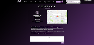
After our first set of audience feedback, we started to change the colour scheme to black, purple and grey. We put the black and purple gradient on institutional pages: Terms and Conditions, Privacy Policy and the Contact page. As a result of the colour change, the page looks a lot more professional than our previous contact pages. The new colour scheme can be seen in the image below.
 |
| Our final contact page |
Target audience feedback
We fixed this issue by adding buttons allowing you to go back to the News and Gallery pages.
Our secondary target audience gave us their opinions, which were very useful to us so that we could tailor the website to younger audiences.
It was important for us to get tertiary audience feedback from older women because we wanted our website to be easy to use for people from their generation so that our website could reach and appeal to a wider audience:
Problems that I faced
There were very few problems that I faced when editing our website. The problems that I encountered were minor and easily fixable.
Some of our Paypal links did not work. When I went to purchase a concert ticket, it failed to take me to Paypal's website. This was simply because the button that we had copied onto every page did not copy the hyperlink. In order to solve this issue, we just added hyperlinks to every button on all 10 tour pages.
Wix has a page limit of 980 pixels. Anything outside of this area is not guaranteed to show up on all devices. Because we were working on large dual screen monitors, we used up all of the space thinking that it would be like that on all devices. However, the page limit meant that some images that we had placed on the sides did not show up on regular sized monitors. We changed the format for most of our website and moved the widgets to the centre of the page where we knew that it would definitely show up.
Although it did not cause us any issues, having to edit one at a time was very bothersome. I would have preferred it if we were able to edit at the same time because that would have been a better use of our time. When all three of us were together in a group, we had to alternate
This is the website that we have created.
 |
| Click on the image to enter the website |
Overview of our website
Overall, I am pleased with the website that we have produced. I found the software very straight-forward and simple to use. Even though it wasn't particularly challenging in terms of technicalities, formatting the web design such as text font and colour, background images and hyperlinks was very time consuming. I liked that we were able to constantly edit and improve the website. I also liked that we could preview it before publishing as it allowed us to test some of the new gadgets that we put in.


No comments:
Post a Comment