

I want to make sure that the images that I use are attention grabbing and interesting enough to intrigue the audience. In order to do this, I will make sure that all four panels are different by using different shot types, different outfits, makeup and hairstyles and different poses. In the end, it will all tie in together with connotations of the music genre, a clear colour scheme and visual motif that is consistent throughout.
I sketched rough flat plans for my initial ideas before showing it to the rest of my group. This was useful to me because I was able to produce a visual construction of what I wanted to achieve and it allowed my group members to contribute and tell me what works and what doesn't work.
Here are my initial flat plans with some reference points and notes:


Initial ideas
I sketched rough flat plans for my initial ideas before showing it to the rest of my group. This was useful to me because I was able to produce a visual construction of what I wanted to achieve and it allowed my group members to contribute and tell me what works and what doesn't work.
Here are my initial flat plans with some reference points and notes:


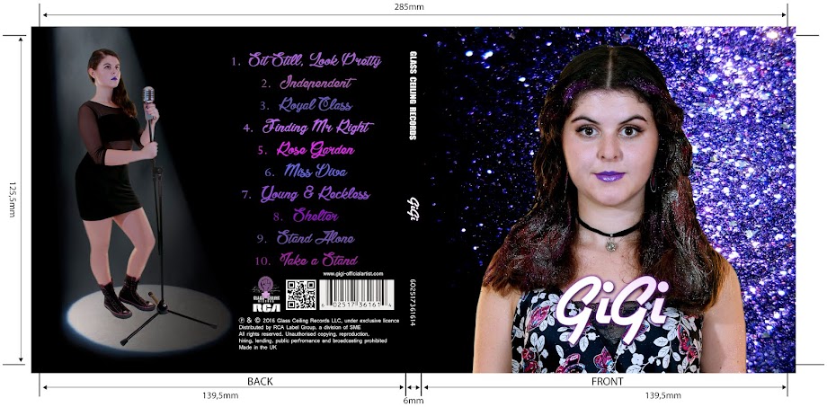
At first, the group liked my idea of the front and back of the artist's face for the outside panels of the digipak. However, on second thoughts I decided that it would be boring to see the back of Georgina's head and it most likely would not appeal to the target audience who need to see more of the artist to identify with them and buy the album. We decided to develop the back panel on the right; having the focal image take up more space. We thought that the front panel on the left would obscure the artist's face and contradict our idea of direct address. In the end, I merged the two together and took the front panel from the left and the back panel from the right to form our final flat plan.
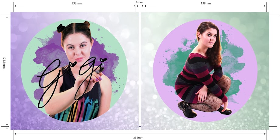
The group liked the idea for the inside panels but we faced problems with the props. Even after researching how to make a DIY throne, we were not convinced that we could pull it off. Gabriel and came up with the idea of the artist signing her name and I think that it would be a focal image for the inside panels. We kept the idea of GiGi signing her name for the final flat plan.

Final flat plans
I started brainstorming ideas for our album cover. At first, I toyed with the idea of purple paint and this led us to thinking of using purple glitter. I researched existing album covers and drew references from Selena Gomez and Rihanna.
I drew the flat plans for our digipak panels with reference points included below.
For the inside, I wanted to show a different side to the artist and focused on having an image that showed a brighter, bubbly personality in contrast from the outside panels. I liked the pose that Carly Rae Jepsen used for Call Me Maybe and was to include that in our digipak. From my research into the feminist movement, I was inspired to include the colours of the suffragette movement in either our digipak or website. Because of this, I would like to put in a purple, white and green background of the inside panels.
These are the inside panels that I drew:
(note - I had originally planned to have the panel of GiGi signing her name in the right panel, but realised that it would be covered by the plastic casing for the CD. Hence, I swapped them around)
Flat planning our digipak panels was extremely important to us so that we have a clear understanding of what shots we want to achieve and how we want the end product to look like. We could also make changes to our ideas as we discovered new themes or ideas.
I drew the flat plans for our digipak panels with reference points included below.
 |
| My drawing of the front cover |
 |
| References for outside panels |
Front panel:
I decided to have a medium close up (MCU) of our artist in the front cover. The shot type and pose was inspired by Selena Gomez's album Stars Dance. The idea of glitter was initiated when I remembered that Hyuna had glitter in her hair for her music video RED. Gabriel and I looked up photos of woman with glitter on their face and decided that it would be viable.
Back panel:
I was mostly inspired by Rihanna's album for Good Girl Gone Bad. It features a focal image of the artist on the left. The tracklist, institutions, barcode and information are on the right. This was unconventional as most institutions run along the bottom and I thought that this would bring a twist to our album cover. However, in terms of shot type, the image on the back is a close up in order to create contrast with the long shot of her on the front cover. I used the same idea to have a long shot of GiGi on the back so as to differentiate with the MCU of her on the front.For the inside, I wanted to show a different side to the artist and focused on having an image that showed a brighter, bubbly personality in contrast from the outside panels. I liked the pose that Carly Rae Jepsen used for Call Me Maybe and was to include that in our digipak. From my research into the feminist movement, I was inspired to include the colours of the suffragette movement in either our digipak or website. Because of this, I would like to put in a purple, white and green background of the inside panels.
These are the inside panels that I drew:
(note - I had originally planned to have the panel of GiGi signing her name in the right panel, but realised that it would be covered by the plastic casing for the CD. Hence, I swapped them around)
 |
| My drawing of the inside panels |
 |
| References for inside panels |
Front panel:
After scrapping the idea of the throne, Gabriel came up with the idea of GiGi signing her name. We were inspired by the font of Carly Rae Jepsen's Call Me Maybe album which looked handwritten and gave the album a personal touch.
Back panel:
I wanted to include the squatting pose that Carly Rae Jepsen has in her album covers.Flat planning our digipak panels was extremely important to us so that we have a clear understanding of what shots we want to achieve and how we want the end product to look like. We could also make changes to our ideas as we discovered new themes or ideas.
No comments:
Post a Comment