For the third week of production, my group will continue to make progress on the music video, the website and the promo shots. Below, I have detailed all of the work that my group has made to the project and how I have contributed to each task.
 |
| This week's production schedule |
Music video editing
After getting a head start on editing the music video last week, our group are in a good position to continue placing shots onto the timeline. I think that the process has been made much easier due to the way that I have labeled and organised our shots in the folders.
I am glad to say that we have received a lot of positive feedback on our current video. Our target audience really like the cross dissolves between the pans, so I am very glad that I came up with the impromptu idea during our main shoot and that my group thought that it would be feasible to reshoot some of our shots to incorporate it into the other setups.
 |
| The cross dissolves into pans have had a lot of positive responses |
Our goals for this week:
- Place more shots onto the timeline
- Make sure that the lipsync matched the lyrics
- Start getting target audience feedback
- Get feedback from our teachers and our media technician
- Make changes according to the response
 |
| Staying late after school to edit |
 |
| Using wavelengths to get a good lipsync |
 |
| Week 3 editing progress |
By staying after school to comb through all of our footage, I believe that I have been able to put a good selection of shots onto our timeline. Nevertheless, there is always room for improvement and I am sure that we can improve the music video by substituting the footage for even better shots. Now that we have a full timeline, I want to get feedback from people outside of our group because they may pick up on things that I hadn't noticed.
I got feedback from my teacher and the media technician so that I could receive constructive criticism.
 |
| Constructive criticism |
Our music video demonstrates a hyper conscience perspective because the singer plays multiple extreme characters as well as herself. We also rely on a lot of intertextuality to comply with Goodwin's theory. As a result, our music video becomes predictable because of the overuse of the different setups and intertextual references. Hence why we need to make it more interesting by intercutting more often.
 |
| The dolls are introduced early on at 0:22 |
 |
| The introduction of the dolls |
I think that the response that we got from our teachers was very useful to us. We made a few changes and I learnt about postmodernist music videos in the process. I will continue to edit and make some changes next week based on the advice that we were given. Next week, I plan to gather more target audience feedback.
Promo shots for the digipak
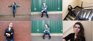
For this week, we have to retake the promo shots with the revised version of the glitter in Georgina's hair. Because this shot is going to be the image for the front panel of our digipak, it is vital that we get it right. In order to compensate for last week's photos, we took a multitude of shots which can be seen below.
 |
| Photos of Georgina from our photoshoot |
 |
| A tremendous improvement from last week's promo shoot |
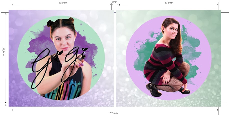
After we got the shots that we needed, the three of us sat down and looked through every photo, narrowing it down to the ones that we liked the most. We made a note of which shots we would use for our digipak and looked at the flat plan that I made for reference. We also found B-cuts that we would use on our website. These shots were more fun and interactive, which I have found to be conventions of promo shots on websites.
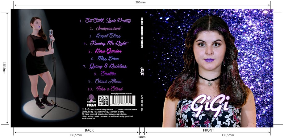
I started editing the photos that we took last week because I want to create a rough edit of our digipak. So far I have used the magnetic lasso, quick selection tool and refine edge to select only Georgina and have placed her onto the digipak template.
 |
| Refine edge |
 |
| A rough edit |
Although I have made some progress on the digipak, it has taken me a long time to choose the focal image and I experienced problems with the magnetic lasso. It is surprising that it has taken me this long to produce a rough edit. The time delay was largely due to waiting to reshoot the promo shoots.
Promo shots for the website
 |
| Daya's promo shots |
 |
| Taking photos of Georgina |
 |
| The promo shots that we took |
Website
We made a lot of progress on the website this week and started adding more to the pages.
Our goals for this week are to:
- create and add links to social media sites
- add photos and videos to the gallery page
- set up purchasing and interactive opportunities - create products and add to shop, write descriptions and return policies
Social media:
We created facebook, twitter, instagram and youtube pages and linked them to the icons in the footer.
 |
| Setting social links |
Gabriel designed the social media pages, keeping it synergistic across the different media platforms with the same profile picture, channel art and the GiGi logo.
 |
| Synergistic social media platforms |
Gallery page:
We changed the gallery from the 3D carousel to a polaroid theme. Even though the 3D carousel was fun and interactive, the audience want to view the whole gallery at once and not one at a time. We split the photos into different sections, similar to how Beyonce separates her editorial from her life and performance photos.
(left) a carousel themed gallery (right) a polaroid themed gallery
Shop:
We have photoshopped more GiGi merchandise for the store to make it seem like a legitimate website. Most artists have dozens of merchandise available for purchase and in order to emulate a real artist's website, we need to customise more products to fill the shop page.
The addition of new items on the shop page
We have continued to make progress over the course of this week. I am happy with what my group members are achieving in their own sections of production. I personally have gotten a lot done on the music video and the digipak is underway.


No comments:
Post a Comment